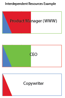
This one may be tricky to explain, but here's the use case. Our organization aims to reduce the amount of "time-stealing" by other staff. We want to eventually see this visual indicator show less intersects, with each resource keeping as much of their available working time free from interactions with other people as possible. For example:
- Person A's total available working time as a circle.
- Person B who requires some of that person's time per month, so both circles intersect the amount of time they interact.
- Person C then requires a big slice of Person A and B's time.
- Person D requires only a little of Person A and B's time.
How could I simply and visually represent such interconnected resource usage? I really can't think of how to visualize this, so am open to any ideas, even 3D if required.
EDIT:
Thank you for the feedback so far.
I could agree to not calling it "waste", but perhaps "shared time". Let's assume my organization is full of really capable people, who if left alone, are super-producers (ignoring reality for a while).
I played with this visualisation, which is getting closer to what I'm hoping for:

As shown, each person has their own colour (the outer line colour. The amount of time shared with another person is always of equal amount on each person's bar, represented by a fill of the shared person's colour.
Everyone has a finite amount of time, so over-sharing can be quickly spotted by those who's boxes are filled up more and the most time demanding people can be seen by their color being in most people's boxes.
This could just as easily be pie-charts, I guess. For our company's purposes, we can limit the total amount of pie or bar charts to around 15, which would still give an at-a-glance feel for the information.